Just like story telling data visualization is an art and science of representing information in a comprehensive way so people have a clear understanding of the information. Analytics with right representation technique can create wonders and if not done right is a waste of time and resources. We at i2e, help organizations explore the possibilities of data to optimize operations and forecasting.
Data Visualization the art and science of representing information in a comprehensive way. What use is information if you cannot understand it to your benefit.
Data the way you want it
Today organizations are backed by data at different levels of hierarchy. We have data for financial planning, KPI reporting, PPM, operational costs, resourcing etc. Clearly, solution. there is no one size fits all template. Depending on your requirements we have different types of data visualization template broadly classified, yet no limited, to three categories.
Data for decision makers
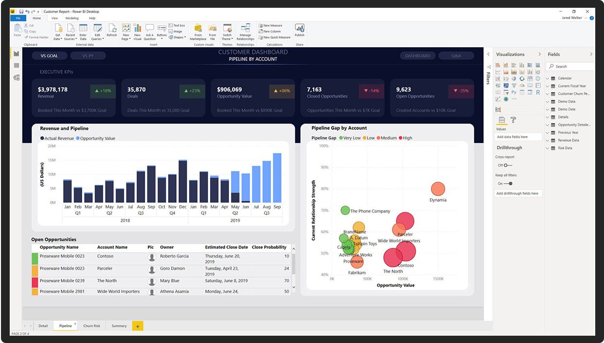
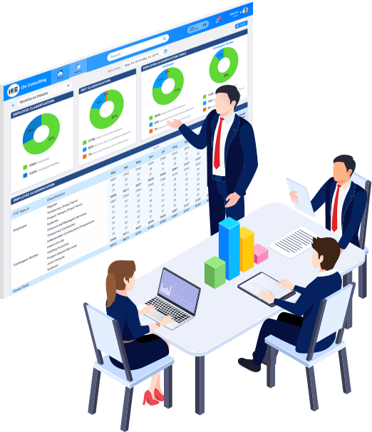
Management or decision makers are more concerned with the overall picture. They want dashboards and reports that present the organizational level with option to drill down as per requirement. They are more concerned with data presentation and forecasting. PPM dashboards , time-based financial reporting, budget analytics etc.
Data of operational heads
Data requirement for operational heads is different form decision makers. They are more concerned with day to day or monthly reporting and analytics. They are the ones who present data to decision makers with analytics. Operational reporting, resource monitoring, R&D etc.

Data for customer facing executives
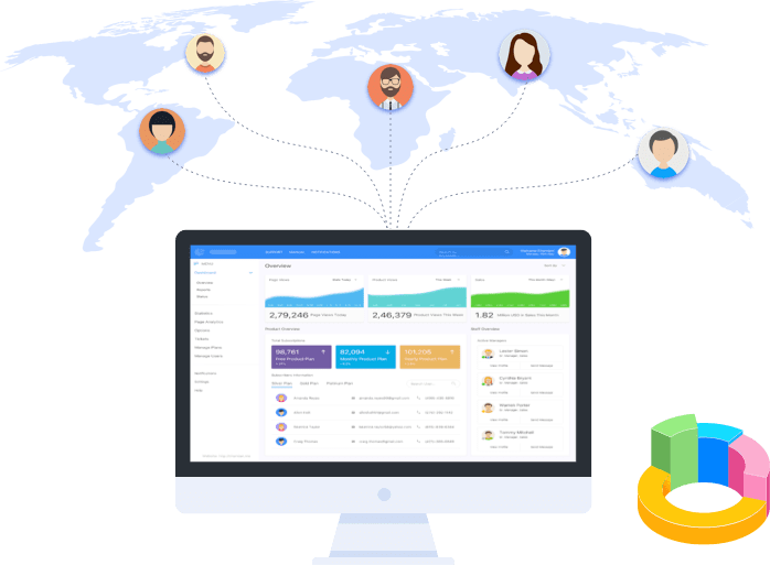
This are the simplest, yet most widely used. The executive level dashboards involve social media engagement, Ad analytics, customer services and support etc. are a few examples.
Related Blogs
Connect to know more
Contact Information
-
93 Shennecossett Rd, Suite # 104, Groton, CT 06340
-
+1(866) 968-9995
-
solutions@i2econsulting.com

